The UT System brand includes several graphic elements: the state of Tennessee, color bar, textures and illustrations. When used consistently, these elements create continuity among a family of materials and build recognition of the brand.
Read on to learn how to use them in materials you create on behalf of the University.
State of Tennessee
The outline of the state of Tennessee is used to emphasize UT’s presence in each of Tennessee’s 95 counties—from Memphis to Mountain City and every county in between, we’re there. The graphics below also denote the connected and collaborative spirit of the campuses and institutes within the statewide UT System.


For the creation of more accurate maps, an Adobe Illustrator file with the county boundaries labeled with county names is provided as a download.
Texture
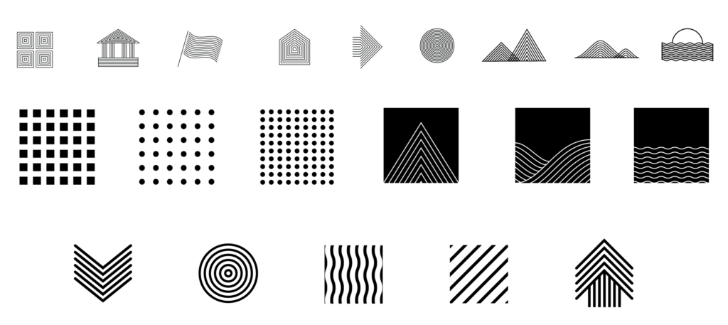
Textures can add depth and surface to a graphic or a communications piece. Our texture library represents the topography, geography and both rural and urban culture in the state of Tennessee.
Illustrations
Graphic illustration elements like the ones below can be sprinkled into your designs for visual interest. While not required for every communications piece, they help reinforce UT System specific messages.
