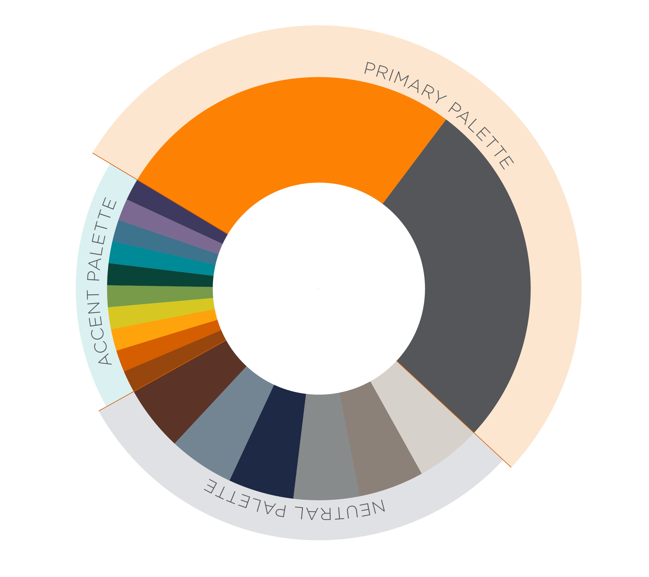
To maximize brand equity existing in Tennessee Orange and Smoky Mountain Gray, the primary palette should always be more than half of the color distribution as demonstrated in the image below:
The neutral and accent palettes exist to support the primary palette. Use of these secondary palettes should never become the majority of any design.
Neutral palette colors can be used in larger quantities than the accent palette, roughly one-third of the distribution.
The accent palette use should strive to be strategic and utilized in small amounts for added variation and dimension, around one-fourth of the color distribution within a design.